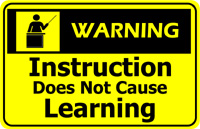
When you create learning materials — whether printed or online — it might be good to do a review with your audience and see if you’ve designed a tool that meets the needs of your audience, or just your experts.
 I’m trying to check in for a flight I’m taking tomorrow morning. It’s with a carrier that I don’t normally fly with, so it’s interesting to see their interface. I found it almost impossible to figure out how to do a task that thousands of people need to do every day. But the site would tell me all about the airline’s mission, why they have a goal of great customer service, how big my bag can be, on and on and on.
There should be three big buttons right at the top:
Buy A Ticket | Check In For A Flight | Everything Else
I do fly with Northwest pretty often, and while sometimes their actual flying leaves a little to be desired, they really have a great web site. The three main tasks I need to do there are actually on the front page — no need to even click.
Is your learning designed like that? Or do you go on and on about your thinking, your opinion on how it should work, or your model of how learners should take in the information?
Add some links to either good or bad practice, from your travels.
{ 0 comments… add one now }